
Over the years I’ve spent advising B2B tech startups, I’ve seen it proven time-and-time again that there’s nothing that’s more crucial to your company’s growth than data-driven decision-making. For that reason, in this blog post I’ll be sharing with you my top tips on the metrics you need to include in your B2B SaaS dashboard in order to best steer your product-led growth (PLG) strategy. Prepare to elevate your growth leadership skills to the next level…
Modern growth leaders must go beyond traditional marketing tactics and really master the art of delivering strategic data-driven growth acceleration. This is where a well-structured growth dashboard comes in… A growth dashboard is like a compass. You should always consult with yours before making any significant marketing or growth decisions. A B2B SaaS dashboard done right will easily steer a SaaS startup through the intricate maze of market performance, user engagement, and business growth complexities that they need to navigate. But, get it wrong and you can expect to waste untold quantities of time and money pursuing a strategy that never would have worked in the first place.
Before digging into my recommendations, let me introduce myself and why I’m qualified to advise on B2B SaaS dashboard design for smart growth strategies. My name is Lillian Pierson. I have spent the last 18 years delivering strategic marketing services for tech companies of all shapes and sizes, from Fortune 100 companies like Amazon and Dell, to VC-backed startups like Domino Data Lab and Cloudera, from bootstrapped tech consulting agencies to self-funded marketing SaaS giants like ClickFunnels, and everything in between.
I’m a Fractional CMO for B2B tech SaaS startups and consultancies. Although I have ample experience advising bootstrapped data and AI consultancies, my main focus is on supporting high-growth VC-backed SaaS startups.
Please note: The advice I offer in this blog post assumes that you are leading growth for a VC-backed B2B SaaS company. The metrics and discussion points are tailored around that key point, and may have limited relevance to other business or funding models.
The advice you’re getting in this post is about what growth metrics you need to monitor to steer your PLG strategy in the right direction.
Structuring a B2B SaaS Dashboard for Maximum Impact
I’m about to share with you the must-have metrics for a B2B SaaS dashboard to inform your strategic growth and marketing decisions. My assumption here is that, if you’re reading this, then you’re a growth or marketing leader who’s looking to make better informed PLG decisions – and subsequently get ahead in your growth leadership career.
But to any founders who are reading this, please take caution. While it’s relatively simple for a tech startup founder to build a dashboard for tracking PLG growth metrics, you also need to know how to interpret these metrics in the context of a broader growth strategy. This type of interpretation requires a significant backdrop of education and experience in both growth and marketing. Even with this B2B SaaS dashboard in place, trying to DIY your growth and marketing strategy is a recipe for disaster. My advice to founders, hire an expert to help you with your strategy if you don’t have one already.
With that out of the way, here’s how I approach structuring a PLG dashboard for maximum impact. First you need to break down your metrics by category, of course.
I suggest the following 6 categories for your B2B SaaS dashboard:
- North star metrics
- Acquisition metrics
- Activation and engagement metrics
- Retention metrics
- Growth and expansion metrics
- Referral and advocacy metrics
It’s always more helpful to show rather than tell, so we went ahead and created an Equals dashboard that shows you some effective ways to visualize PLG metrics so that they’re easy to understand with just a passing glance.

Let’s look at each of these categories a little closer…
North Star Metrics
If you’re leading a B2B SaaS company, I recommend focusing on Payback Period as your primary metric. While the LTV/CAC ratio has traditionally been used for tracking the long-term profitability of your customer acquisition strategies, be sure to prioritize metrics that offer quicker and more reliable insights into customer acquisition efficiency.
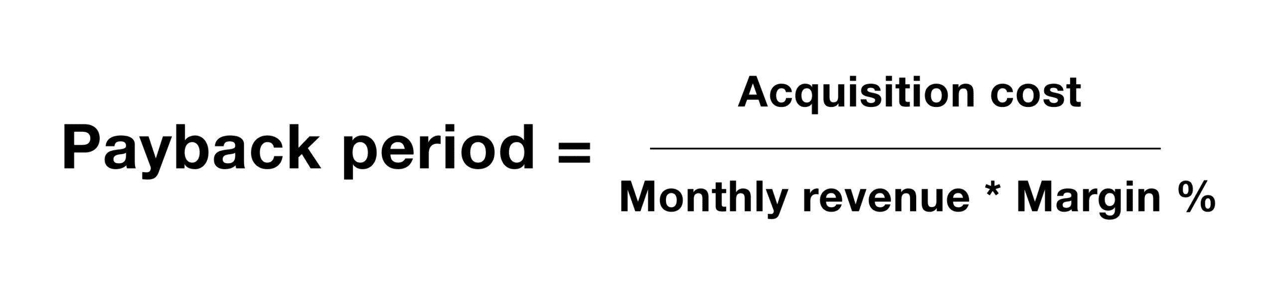
Payback Period
The Payback Period is the amount of time it takes for a company to recoup its investment in acquiring a customer. In other words, it’s the time it takes for the net profits from a customer to equal the initial Customer Acquistion Cost.
Using a line chart here within your B2B SaaS dashboard helps depict the trend of the Payback Period, thereby offering instant insights into the efficiency of investment in customer acquisition.
This metric is crucial for understanding cash flow implications and the immediate financial impact of customer acquisition. Naturally you want a short Payback Period, as shorter a Payback Period means that the company regains its investment faster. This is particularly important for startups and companies with tight cash flows, or the need to secure further VC-funding.
From my experience, the ideal Payback Period varies depending on the business model and industry. For B2C SaaS companies, a Payback Period of less than 3 months is often desirable. For B2B SaaS, it may extend to less than 8 months. If your Payback Period is longer than these benchmarks, you’ve either got a leaky funnel, a positioning / relevance problem, or worse – a product problem.
Personally, I love Payback Period as a northstar metric because:
- It focuses on the speed and efficiency at which you can make back your investment and invest more into acquisition.
- It is a wonderful metric for aligning marketing with product growth.
Here’s how to calculate your Payback Period:
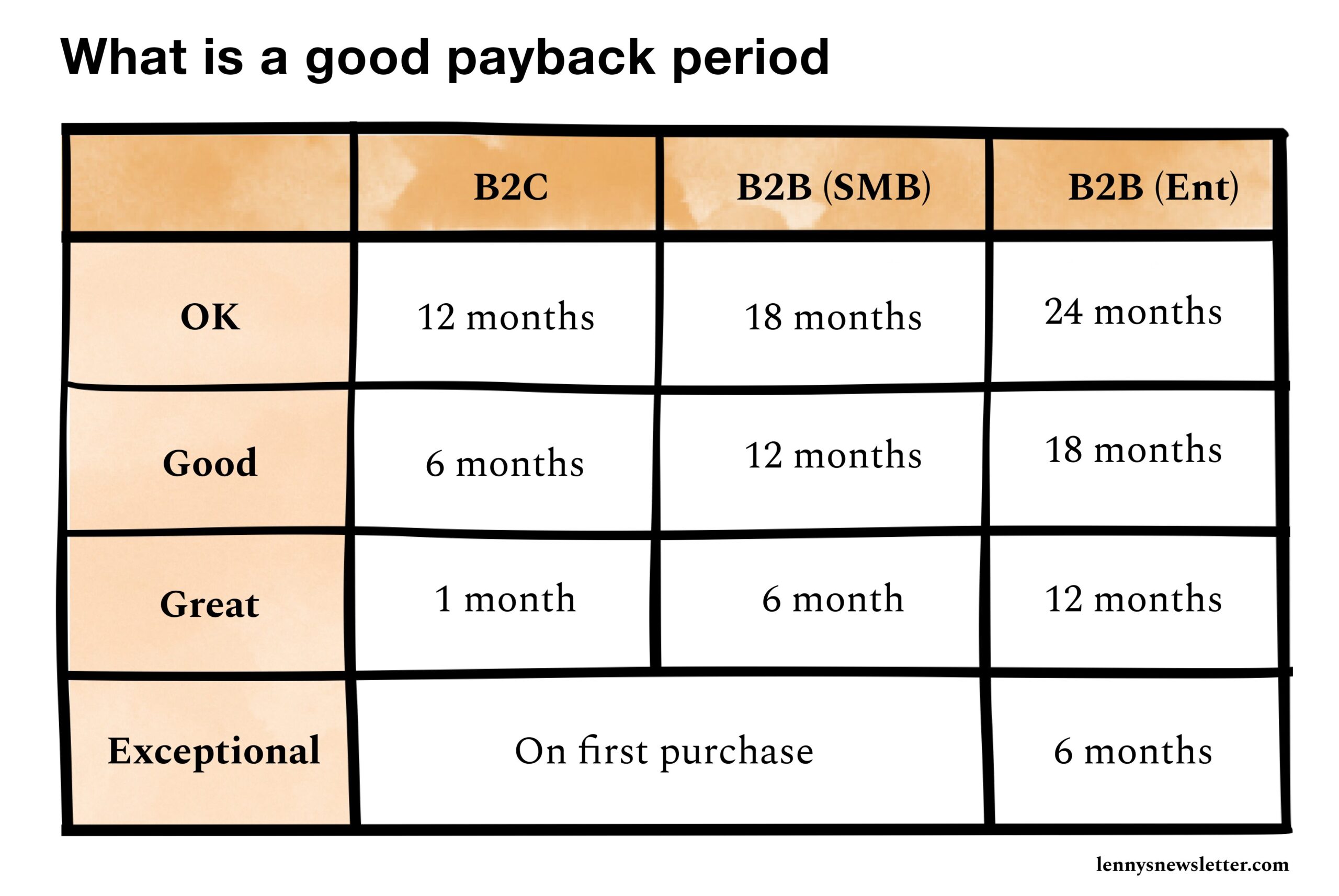
And if you’re interested in more industry benchmarks regarding Payback Period, here’s what Lenny Rachitsky has to say:
LTV/CAC Ratio
Another good north star metric for any B2B SaaS dashboard is the LTV/CAC Ratio, This is a key metric for understanding the long-term value of customers relative to acquisition costs.
This ratio compares the Lifetime Value (LTV) of a customer to the Customer Acquisition Cost (CAC). LTV represents the total revenue a company expects to earn from a customer throughout their relationship, while CAC is the cost of acquiring a new customer.
The LTV/CAC Ratio is useful for assessing the overall efficiency and sustainability of a company’s sales and marketing efforts, where a higher ratio indicates that the company is generating more revenue per customer relative to the cost of acquiring them.
Generally, a healthy LTV/CAC Ratio is considered to be 3:1 or higher, meaning the lifetime value of a customer is three times the cost of acquiring them.
Note: In the context of a SaaS business model, LTV is generally realized over a long period, typically between 5 to 10 years.
Acquisition Metrics
When evaluating acquisition metrics, I look for trends and patterns that indicate the effectiveness of our initial user attraction strategies. The relationship between site visits, sign-ups, and the resulting CAC offers invaluable insights.
This is really about understanding the story behind the numbers. For example, a spike in sign-ups without a corresponding increase in engaged users might signal a need to refine our targeting strategy.
The acquisition metrics I suggest you track on B2B SaaS dashboard like this are:
- Free Trial Signups (#): This measures the effectiveness of initial user attraction strategies.
- Website Visits (#): Tracks the effectiveness of online presence and marketing campaigns in driving traffic.
- Website Conversion Rate (%): This measures the conversion of site visitors to registered users. This is a measure of how well targeted your traffic is to the UVP of your product, and how effective your website is at converting visitors.
- Customer Acquisition Cost (CAC, $): This metric reflects the cost of acquiring new customers.
While CAC is an essential and foundational metric to every B2B SaaS dashboard, it should not be used as a north star metric, simply because it doesn’t account for the cost efficiency of your customer acquisition activities. Furthermore, CAC is unable to account for the lag in positive brand effects that result from your marketing spend (things like PR, organic SEO blog asset creation, organic social media and newsletter activities, advocacy, and referrals that happen outside of the predefined CAC sales cycle).
Activation and Engagement Metrics
In PLG, activation and engagement are the lifeblood of growth. Metrics like free-to-paid conversion rates and feature adoption rates are reflections of a product’s value proposition.
Time-to-value (TTV) is particularly close to my heart, as it directly correlates with first impressions. A short TTV often leads to higher engagement and retention rates.
- Free-to-Paid Conversion Rate (%): This metric tracks how well your funnel is converting free users into paying customers. It’s a key measure of initial user activation.
- Feature Adoption Rate: This indicates how frequently users are engaging with various features of the product. This reflects on product value and user activation. I recommend using a bar chart to display this metric.
- Time-to-Value (TTV, #): This measures the speed at which users are able to generate value from your product in a self-serve environment. It’s an important metric for understanding early user experience and engagement. TTV is best measured in days, of course.
Retention Metrics
Retention metrics like user retention rate, product stickiness (DAU/MAU), and churn rate are crucial barometers of long-term success. In my experience, these metrics are the true test of product-market fit.
High retention and low churn signify that we are meeting customer needs effectively. These metrics also guide our product development, indicating where enhancements or changes might be necessary.
- User Retention Rate (%): Measures how well the product keeps users engaged over time, indicating long-term user satisfaction and product fit. This measures the rate at which a company retains its customers over a given period of time. It is calculated by subtracting the number of new customers acquired during that period from the number of customers at the end of that period, dividing by the number of customers at the start of the period, and then multiplying by 100 to get a percentage. A high retention rate, of course, indicates that more customers are staying.
- Product Stickiness (DAU/MAU, %): This indicates how often users engage with the product, a key indicator of its ‘stickiness’ or ongoing user engagement. A high ratio of DAU to MAU (aka; “DAU/MAU ratio”) indicates that users are returning to the product frequently, suggesting high stickiness.
- Churn Rate (%): This metric tracks the rate at which customers stop using the product, which is crucial for understanding user retention challenges. This measures the rate at which customers or subscribers stop doing business with a company over a given period of time. It is calculated by dividing the number of customers lost during that period by the initial number of customers at the start of that period. A high churn rate indicates more customers are leaving.
Growth and Expansion Metrics
Growth and expansion metrics, including Product Qualified Leads (PQLs) and expansion revenue, are key indicators of a product’s scalability and market acceptance. Consider including them on any B2B SaaS dashboard.
PQLs, in particular, have been a game-changer in our marketing strategies because they allow us to focus our resources on the most promising leads. Expansion revenue, on the other hand, reflects our success in not just acquiring but growing customer accounts, a critical aspect of sustainable business models.
Key growth and expansion metrics include:
- Product Qualified Leads (PQLs, %): This metric identifies which percentage of leads are highly engaged with the product and likely to convert, which is important for evaluating growth-focused marketing strategies. Defining who qualifies as a “qualified lead” is a subjective process, and the criteria and scoring for PQLs will vary depending on the product, target market, and specific user journey. The goal is to identify those users who are not just interested in the product but are also actively benefiting from its use, thus indicating a higher likelihood of converting to paying customers.
- Expansion Revenue (%): This measures revenue growth from existing customers through upselling, cross-selling, or upgrades. This reflects the success of account expansion efforts and is a critical metric for many businesses, particularly those operating on a subscription model. It’s measured as a percentage of revenue expansion from your existing customer base over a given interval of time.
Referral and Advocacy Metrics
Finally, referral and advocacy metrics, like Net Promoter Score (NPS), provide a window into your customer experience and loyalty.
A high NPS is often a precursor to organic growth through word-of-mouth and customer advocacy. It’s a metric that goes beyond the dashboard. It influences everything from customer support strategies to product development.
- Net Promoter Score (NPS, #): This metric gauges customer loyalty and satisfaction, which can indicate the potential for customer referrals and organic growth.
By focusing on these key metrics and interpreting them through the lens of your overall business objectives, you can make informed decisions that drive sustainable growth.
In my role, I’ve seen firsthand how a well-structured B2B SaaS dashboard is a powerful tool for decision-making and strategy development. Each metric we track is a piece of a larger puzzle, and it’s my job to put these pieces together to form a comprehensive picture of our growth trajectory. By focusing on these key metrics and interpreting them through the lens of your overall business objectives, you too can make informed decisions that drive sustainable growth.
Moving Beyond the Basics with Enhanced Dashboard Utility
In the evolving landscape of SaaS startups, having a basic B2B SaaS dashboard is just the starting point. For the dashboard to be useful, you need some advanced features and integrations.
Let’s look at a few of the simple requests you can provide your team in order to elevate your dashboard from a simple data display to a dynamic tool for strategic decision-making.
Customization and Filters
If there’s a budget, it’d be ideal for your B2B SaaS dashboard to also be useful for team members other than yourself. The first step to making that happen is to request customization and filtering capabilities.
A one-size-fits-all approach rarely suffices in the nuanced world of SaaS metrics.
Customization will allow each team member, from marketing to product development, to tailor the dashboard to their specific needs. Customizations could include custom views for different user segments, time periods, or product lines.
Filters, on the other hand, enable users to drill down into the data to focus on specific metrics or time frames that are most relevant to their current objectives. This level of personalization ensures that the B2B SaaS dashboard remains relevant and useful for all stakeholders.
Real-Time Data and Alerts
In our fast-paced industry, outdated information often causes missed opportunities and misguided strategies.
From my perspective, the integration of real-time data feeds for your B2B SaaS dashboard is an absolute non-negotiable.
But coupled with this, you also need a robust alert system to notify you and other team members when certain thresholds are met or when unexpected patterns emerge. Alerts like this are essential in situations where swift and proactive responses are required. Whether it’s a sudden spike in user churn or an unexpected drop in feature usage, real-time alerts help in maintaining a constant pulse on the product’s performance.
Integration with Product Analytics Tools
For a B2B SaaS dashboard to be truly impactful, it must seamlessly integrate with other product analytics tools. This integration ensures a continuous and automated flow of data, thus eliminating the need for manual updates and reducing the risk of errors.
Whether it’s pulling in data from customer relationship management systems, marketing platforms, or user feedback tools, integration is key to achieving a holistic view of your product’s performance and customer experience.
I really like Equals Dashboards for these capabilities, because – with Equals – you can get all the integrations you need for your B2B SaaS dashboard, in an environment that makes it easy for your development team to build and deliver.
Other Equals features that I love:
✅ 𝐄𝐚𝐬𝐞-𝐨𝐟-𝐮𝐬𝐞: With its intuitive interface, you can easily connect a variety of data sources like PostgreSQL, Snowflake, and Stripe. The Query Builder and SQL Editor cater to both beginners and advanced users, allowing for complex data manipulations without the need for extensive SQL knowledge.
✅ 𝐅𝐚𝐦𝐢𝐥𝐢𝐚𝐫𝐢𝐭𝐲: Equals’ pivot tables, charts, and Excel-based formulas bring a familiar yet enhanced experience to data analysis.
✅ 𝐀𝐈-𝐢𝐧𝐟𝐮𝐬𝐞𝐝 𝐚𝐬𝐬𝐢𝐬𝐭𝐚𝐧𝐜𝐞: Equals’ AI Assist feature offers capabilities like automated text summaries and smart dashboard generation.
✅ 𝐇𝐢𝐠𝐡𝐥𝐲-𝐜𝐨𝐥𝐥𝐚𝐛𝐨𝐫𝐚𝐭𝐢𝐯𝐞: Collaborative features like multiplayer collaboration, comments, and access controls make Equals an ideal tool for team projects.
✅ 𝐄𝐟𝐟𝐨𝐫𝐭𝐥𝐞𝐬𝐬 𝐫𝐞𝐩𝐨𝐫𝐭𝐢𝐧𝐠: With Equals, you can transform raw data into insightful reports effortlessly, and on auto-pilot.
Enhancing your B2B SaaS dashboard involves a strategic blend of customization, real-time data, and seamless integrations. These enhancements help transform your dashboard from a static data repository to a dynamic tool that you and others can use for improved decision-making.
Feel free to borrow the recommendations from this blog post when instructing your executional team on growth dashboard requirements so that you can position yourself as the proactive SaaS growth leader we both know you are.
Conclusion
Building the ultimate B2B SaaS dashboard involves an intricate dance of both art and science. It requires a lot more than just data aggregation. You’re building a strategic command center to guide yourself and your teams through product growth and marketing complexities.
This guide has illuminated the path towards building a dashboard that embodies the principles of product-led growth by blending insightful analytics and intuitive design. A well-designed dashboard in Equals transforms the approach of a SaaS growth leader by providing you a panoramic view of the product’s journey, user engagement, and financial health.
The right B2B SaaS dashboard empowers growth leaders to make decisions that are not just reactive to market changes but are proactive and strategic, thus ensuring sustained growth and success.
As a fellow growth leader in the SaaS domain, let me tell you, our biggest challenge these days isn’t just staying ahead of the curve – We have to redefine it.
Use the insights and strategies outlined in this guide as requirements that your executional team can use to build a B2B SaaS dashboard that stands as a beacon of innovation and efficiency. Leverage the power of Equals to build a dashboard that not only tracks your growth but accelerates it.
A B2B SaaS dashboard is a reflection of your strategic vision and commitment to growth. Start today by assessing your current dashboard and identifying areas for enhancement. Implement the strategies discussed above, and watch as your dashboard transforms into a dynamic tool that propels you to new heights in your growth leadership career.
🤍 This blog post was produced in proud collaboration with Equals. 🤍